Introduction
In the last years the importance of gestures has risen constantly. Although we all know gestures as a form of non-verbal communication, we also use them to interact with various devices. This post is about the evolution of gestures in the world of mobile devices.
The basic input commands for displays are touches, swipes, drags and pinches. With variations or combinations like double touching, long pressing or long press dragging a none too small repertoire is available. Besides these basic gestures, new forms of interactions evolve constantly. The focus here lies on natural behaviour and intuitive workflows.
Starting off with some basic platform specific gestures from Android and iOS I will go on to analyse some patterns throughout selected apps.
Notification Screens
An essential component of mobile OS are notifications. Android and iOS go a similar way by providing a gesture to pull the notification screen down from the top edge of the screen.

In Android an additional gesture for notifications is available: When pinching a notification element horizontally, it expands. That presumes that the notification element carries more information than it can show in a regular notification. With a swipe to the left or right the notification can be dismissed.
Quick Actions
Like to the notification screen the quick action screen is represented on Android and iOS. The quick actions under Android are accessible by a two-finger-swipe-down from the top or the settings icon on the notification screen. iOS follows a different approach with a swipe up (from the bottom). Android handles this gesture with the launch of Google Now.

App Switcher
Android’s app switcher is a great example of natural behaviour. The running apps are listed vertically and with a swipe to the left or right the app can be closed. With iOS 7 a app switching pattern established which is very similar to Android’s. The running apps are listed horizontally and with a swipe up the app can be closed.

Patterns
Now that we have covered the system dependent gestures it’s time to take a look at various gesture patterns using exemplary apps.
Youtube
A very interesting gesture has found it’s way to the Youtube app which should empower people to search for other content without aborting the current video. By dragging the video down, a decent, transparent overlay appears behind the video to indicate a view change. The video can be brought up again with the inverse gesture, or closed with a swipe to the left. It’s like throwing the view away – similar to the app switcher.

Another gesture element in the Youtube app is the Navigation Drawer, a pattern which has established in the last few years on mobile devices. It implies that a view is hidden on the left side of the screen. By now thousands of developers have adapted this pattern to their apps. Here is a great overview of the functionality from the Android developer site:

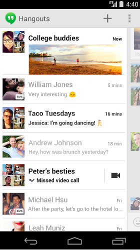
Hangouts
Google’s messaging app Hangouts is also built on an interesting concept: The conversation overview indicates a detail view on the right border. By swiping left or right the particular view shows up. This type of navigation creates a highly dynamic impression. A scope of application could also be a master-detail implementation.
Gmail
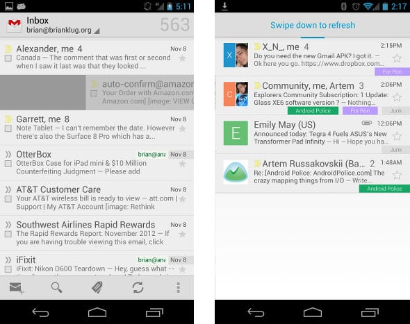
A rather common gesture is illustrated by the Gmail app: The swipe-to-delete gesture. It inhabits the same principles as the app switcher. When content is presented in a list which can be modified (delete, archive…) this gesture represents maybe the most natural way to get rid of an item.
Another wide spread pattern is the swipe-down-to-refresh gesture, which is also integrated in the gmail app. This gesture makes sense, because it replaces the regular boundary with a kind of enhanced boundary, which communicates more dynamics. Of course the functionality is well-known from refresh icons, but this way of updating a list is clearly more intuitive.
Timely
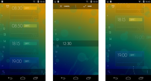
Bitspin – a little company from Switzerland – created this alarm app. They joined Google in January 2014. With a strong focus on design they stand out in an ocean of alarm apps. The most interesting gesture here is when setting an alarm: On the left edge the numbers (0-24) are displayed. With a swipe from this left edge toward the right side a decent animation starts and you can choose the time by dragging your finger up/down. To remove an alarm just swipe the alarm to the right; again a great implementation of the swipe-to-delete gesture.
Chrome
Switching tabs in a mobile browser can be an unpleasant task. Formerly Chrome implemented the tab switching logic with a swipe from the left/right edge to the other (similar to the navigation drawer). But now it has become more precise by limiting the gesture to the action bar. Although it’s unlikely that Google ever implements a navigation drawer in the Chrome app (which would require three top-level views), this step makes sense to avoid gesture conflicts and to ensure further consistency.
The second gesture is a swipe down from the action bar to access the tab overview. That kind of visualisation is a prime example of multiple layers in a view.

Play Music
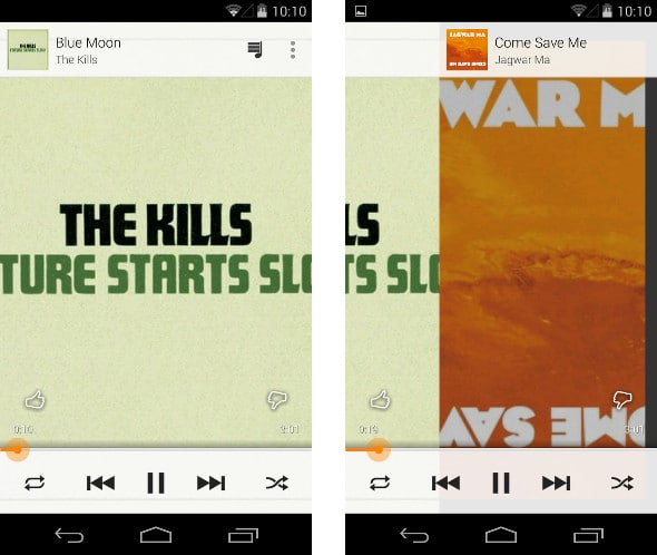
Yet another Google app: Play Music is a sophisticated app that offers various gestures, of which the “next/previous song” gesture lies in focus of this section. The classic controls are still available, but supported by the horizontal swipe gestures: Swiping leftwards brings the next song to the foreground and swiping to the right leads to the previous song.
A future prospect: At the end of 2013 Google acquired Flutter, a startup developing a hand-gesture interface. It’s the company behind control navigation for iTunes, Windows Media Player and Winamp. For future updates it’s very likely that Google will somehow integrate this new knowledge to offer a hands free gesturing experience.
Paper
On February 3rd 2014 Facebook launched it’s standalone app Paper, which should herald nothing less than a new way of storytelling and content consuming. The basic structure is: cover images on top (sections) and stories on the bottom.
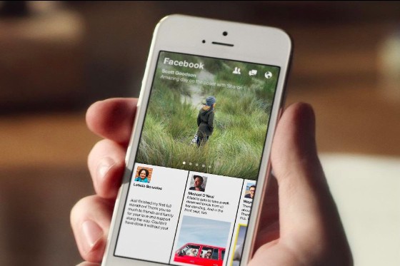
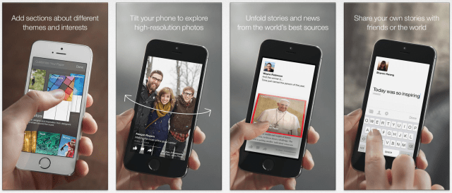
One way to use the app is to scroll through horizontally in half-screen mode. When selecting (tapping on) a story it is maximized with a fine animation and emphasizes on the content. In this fullscreen mode the stories can be switched with a swipe to the left or right. If you see a story you like, you can just pull (swipe) up and it opens the webpage. This gesture is inspired by unfolding/opening a newspaper.
When scrolling through the sections in the upper half you can easily add new content by pulling down the view. There you can add, remove or even reorder sections with drag and drop. This process feels a lot more natural than selecting various sections in a listview.
Photos are looking especially great thanks to some UI tricks like panoramic viewing: When opening a picture that’s bigger than the portrait view you can tilt the phone left and right to get kind of a augmented reality view for photos.
With this new approach of consuming media, people are more likely to slow down and think about the posts. Classical newsfeeds are mostly just scrolled through and overflown. But this lean-back and
one-content-at-a-time (fullscreen) style has the potential to raise the user’s focus on selected content.
Sailfish OS
This section gives a brief insight into the Sailfish operating system which is driven by Jolla (former Nokia employees). At the end of 2013 the Jollaphone was released. There are no control buttons on the Jollaphone. That’s because the Sailfish OS is specially designed for gesture based interaction:
Apps & Homescreen
- Swiping from the left or right edge minimizes a running app (in the foreground) and returns to the homescreen.
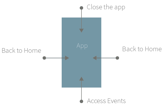
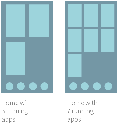
- The homescreen shows an overview with up to 9 running apps. On the bottom are four app icons positioned.
- Scrolling down the homescreen gets the user to all installed apps. With a long press, a known pattern from other mobile os, the icon can be repositioned or deleted.

Swipe
- If an app provides menu options, they indicated at the top of the screen. A swipe down then enables the access to the menu options.
- A swipe from the top edge (Android: notification screen) closes the respective app.
- The notifications are shown with a swipe from the bottom edge of the screen.
- The back- and forward actions inside a app is implemented with simple left and right swipe gestures (not from the edges!).
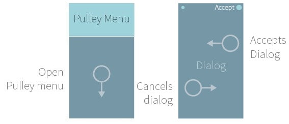
- When a dialog appears it can be accepted by swiping it to the left, or cancelled with a swipe to the right.
Additional stuff
- The menu in the lockscreen provides quick access to camera and phone.
- The phone can be activated by a double tap on the display.
Conflicts
It’s also possible to run Android apps on the Sailfish OS. And when two different operating systems meet, some basic (gesture-)patterns are predestined to clash. Especially apps which are using a navigation drawer: With a swipe from the left edge it collides with a essential gesture from Sailfish OS.
Conclusion
We have seen various approaches to bring more natural and intuitive gestures to touchscreens. Google does a good job when it comes to designing new ways of interactions, which is not surprising, as the company is the root point for Android. And recent developments like Sailfish OS or Facebook’s Paper app show that we haven’t reached the zenith of gesture interactions. They are becoming more and more relevant for the next wave of successful apps.
Gestures in Apps,
Very interesting article, thank you!